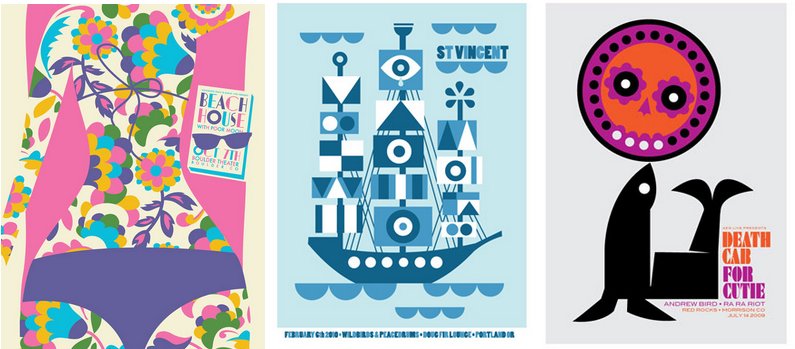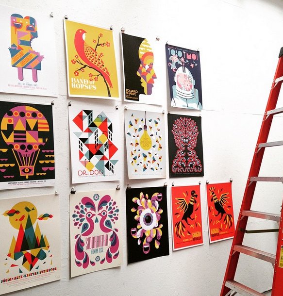
Dan Stiles is best known for the hundreds of concert posters he has designed for indie rock bands from Wilco to The XX, but he’d like you to know that his work doesn’t stop there. Stiles has also illustrated children’s books, created fresh, reimagined cover art for literary classics by authors such as Anthony Burgess, and designed the packaging for a Pop Culture soda line, Obamagranite soda. Yes, that’s a combination of the words Obama and pomegranate.
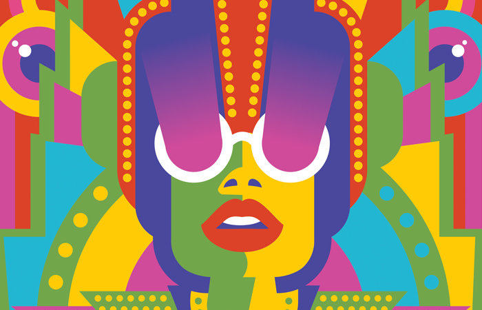
One thing that has defined his work over the decades is his sleek, pared down style, which has been inspired by everything from vintage advertising, to “shitty B movies,” to punk and the high modernism of the 60s.
Stiles visited The Powerhouse Arena on June 3rd to launch One Thing Leads to Another, a retrospective of his work, and discussed what it’s like to create for big name artists, his opinion on what makes a design successful, and more. His show will be up throughout June 2015.
Q: Have you ever received any negative feedback from an artist or a fan?
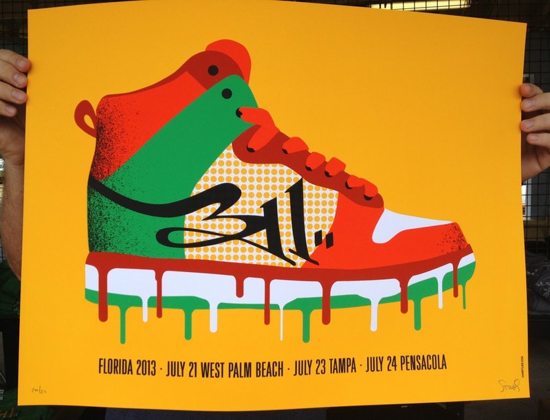
A: I designed a 311 poster for a show they did in Florida a few years ago. They are a rap rock reggae fusion band. When I was thinking it through, I thought, what’s a rap hip-hop thing? Sneakers […]I’m going to do it in the red, black, and green to get that reggae vibe, and the show is in Florida, so the shoe is gonna be melting because it’s really hot.
The band was really happy with it, and they actually made t-shirts of the design as well as posters. But about two weeks later I got an email from a guy who was a 311 super-fan […] he was pissed because he hated my poster, he thought it was the worst thing that ever happened, but because he goes to all the 311 shows and buys two posters at each show, he had to buy my poster, twice. He wrote me this email that was about fifteen paragraphs long that was about how I essentially ruined his life with my shitty poster. I’d never encountered anything like that before.
But on the flip side, Flight of the Conchords contacted me to work with them, which was super cool. A lot of times I work with a band’s people, but I was excited to work and collaborate directly with the artists for this project.
It can be a really great experience to work with the bands, and you don’t often get that. Some people ask “do you go out and party with them after the show?” No, they get back on the bus and they drive away and that’s kinda it. It’s not as rock and roll as you think it would be, which is kind of sad. These bands are playing 40 shows in 50 nights. It’s hard work.
Q: Are you more in contact with the venue spaces, or with the artists?
A: I started working with venues and promoters because I started back before you could call a band on the phone or e-mail them or text them or twitter them or whatever. The only people who were making posters were promoters. Their job is to promote shows, the poster used to be their primary tool.
Eventually the poster changed from being a promotional item that you hang up on a street to something that gets sold in the merch booth, and as that started to change, technology improved and now the bands could find me and I could find them.
“Basically, thanks t0 the internet, it got easier to work directly for the band as opposed to people who are promoting the show.”
Q: What positive feedback have you gotten from artists or fans?
A: The nice thing about rock posters is that clients hire you and they want you to do what you do, so they don’t art direct. The art directed posters almost always fail. Typically they point out some pieces you’ve done in the past that they like, and from there it’s either a thumbs up or a thumbs down on what you’ve created.
It’s a lot more like making music. Do you like a song or do you not like a song? The audience doesn’t try to change a song if they don’t like it. I think recording artists are more familiar with that process than a lot of other people and they give you some space to do your work. It’s also a pretty short turn around type of thing, you don’t have nine months before the show, you have three, maybe, four weeks. They know as well as I do that the art needs to be to the printer at least two weeks before the show or it’s simply not going to happen in time. They see the art, and if they like they say, “cool, ok, run with it!” Not a lot of revisions going on.
Q: Do you think that working under that pressure is a positive thing?
A: I think it’s a positive thing. The reason I don’t make fine art is that I’d never get anything done. There’s no pressure! You could work on a painting for three years, nobody cares, but if someone’s show is in seventeen days, you gotta get going. It pushes you to stay up late and get it done so you can get it on press and move to the next looming deadline.
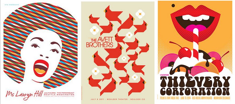
Q: A lot of your work is very pared down and minimal. Can you describe your relationship to this style?
A: Many people understand minimalism, but there are a lot of people who don’t. Some people really enjoy work that looks like it was really hard to make. The more it looks like blood, sweat, and tears, the more lines and the more colors, the better.
I think it’s a very different mind set to appreciate something where you’ve stripped down and condensed it to the point where it tells a story with as little as possible. Taking a blank piece of paper and building it up is what a lot of people expect art to be, they don’t think of it as “I can take a lot and make it say more with less.” I reduce, cut away, condense and collapse. I play with negative space.
Q: What is your criteria for a successful piece, or do you just know it when you see it?
A: During a late night design session, Michael Cronan once told me about “ah, aha, haha”. He told me, when you look at a design, it’s gotta make you emote at least one of those things.
First there’s the “ah,” which is the sublime, it takes your breath away it’s so beautiful. The “aha” is where you look at it and you have to pause and think, and then you see something else. A letter makes a face, a tennis raquet is actually the Eiffel Tower, the arrow in the FedEx logo. There’s something in the design that engages the brain. A double meaning, a pun, a hidden image.
The “haha” is humor, which is actually quite difficult to do using only images. Obviously there are way more ways to make graphic design than these, but they are a good way to look at something to decide if it’s compelling, does it make me emote? If it doesn’t, it’s just a bank brochure. We’re supposed to be conveying meaning in design, it’s not just sitting on a shelf.
“Designers job is to make the viewer feel something about whatever they’re viewing. It’s a good exercise, start picking stuff up and asking, what does this make me feel?”
Q: What artists do you reference in your art or are inspired by?
A: What I do now is an amalgamation of an entire lifetime of digging different kinds of art, so there’s influence from comic books, Japanese anime, shitty B movies, but I think what people mostly see stylistically is modernism. Paul Rand, Saul Bass, the high modernism of the 60s, there’s a lot of references to the psychedelia of the late 60s and early 70s. A ton of the mental source material comes from punk, like sculls and eyeballs and such are all picked up from the early 80s hardcore.
It’s really just a lot of stuff that’s gotten squished together in my head over the years. I never sat down to develop that style on purpose. If you do something every day, you eventually make your own way of doing it.
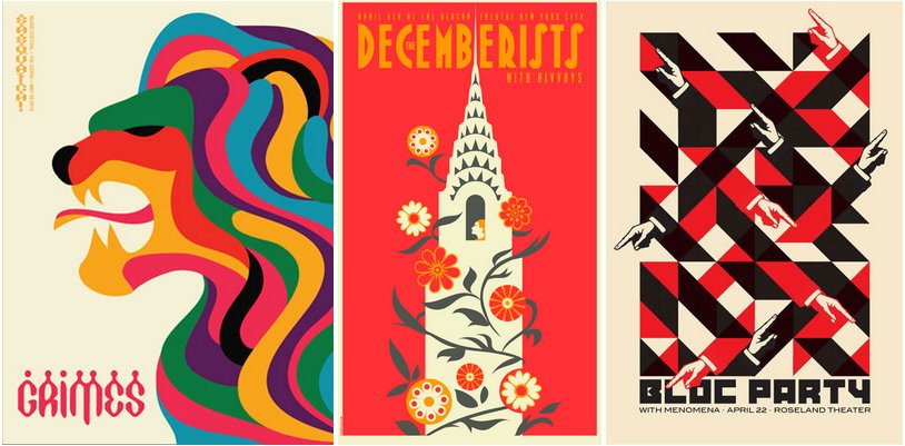
Q: Where do you see yourself going from here?
A: Originally I worked really hard to get in to posters, because I was an un-trained artist. Eventually I went to design school and worked really hard to get into traditional design. After I realized a lot of that kind of work didn’t interest me, I again worked really hard to get back into posters, but with more experience and a larger skill set.
I realize now that I’ve pigeonholed myself as a poster guy, but I’ve designed all this other stuff – books, websites, advertising campaigns, packaging and fabrics, so right now I’m trying to convince the world that these images they love don’t only have to live on a eighteen by twenty-four pieces of paper.
I don’t want clients to think, oh, we can’t use Dan because we don’t need a poster, I want them to think, “oh, we like this guys art, we can apply this to whatever we’re doing right now.”
